

Torrid Holdings, Inc.
Mobile & Website Redesign
Torrid Holdings Inc. (CURV) is an American apparel and accessories retailer, particularly known for its plus-size clothing for women. The company was founded in 2001, initially as a subsidiary of Hot Topic, and later spun off to become Torrid, LLC. The company sells its products through its e-commerce platform and physical stores.
Project Overview
Problem
The Product Landing Page (PLP) and Product Description Page (PDP) had a high bounce rate and low engagement, due to users feeling overwhelmed, frustrated, and confused.
Goal
How might I create a PLP and PDP experience that is digestible, intuitive, and allows the user to feel in control and confident to move along the shopping flow?
Impact
Putting the user in control of their filtering and shopping experience
Creating an immersive layout with a 3-grid layout on PLP
Improving information hierarchy and alignment on PDP
Updated existing features such as Select Fit Model and Product Filtering to be more accessible for the user
Details
Role
UX Designer | UI Designer | UX Researcher
Timeline
8 Months (Agile)
Scope
Product Description Page (PDP), Product Landing Page (PLP), Cart, and Checkout
Client Team
Project Manager | Web Analyst | Product Owners | UX Designer
Methods
Problem Definition | Wireframing | Prototyping | User Personas | A/B Testing | Usability Testing
My Design Process
-

Discover
-

Define
-

Test
-

Deliver
Step 1: Understanding the Interface
Perform a site/page audit
Note down features and tools with high interaction using heat mapping through ContentSquare
Understand present features that are underutilized and determine opportunity points and next steps
Step 2: Understanding User Patterns

User Interviews & Usability Studies
Interview 7 Torrid customers from all different loyalty groups
30 min zoom customer sessions
Task: Start from Homepage and checkout a pair of jeans you would think will fit you perfectly!
Analyze patterns in user behavior on PLP and PDP
Data Analysis
Existing analytics and testing showed that the site already offered helpful features the user was requesting, however they were under-utilized due to poor UX/UI.
Step 3: Synthesize Findings
5/7 of the users mentioned that they heavily use the filter functionality, but found the current interaction frustrating, comparing it to other sites
Many users mentioned the site feels outdated and too marketing heavy
Useful information was found below the fold, causing users to hunt for information or miss it entirely
Existing features needed to be revisited to create a more appealing and intuitive interface and experience
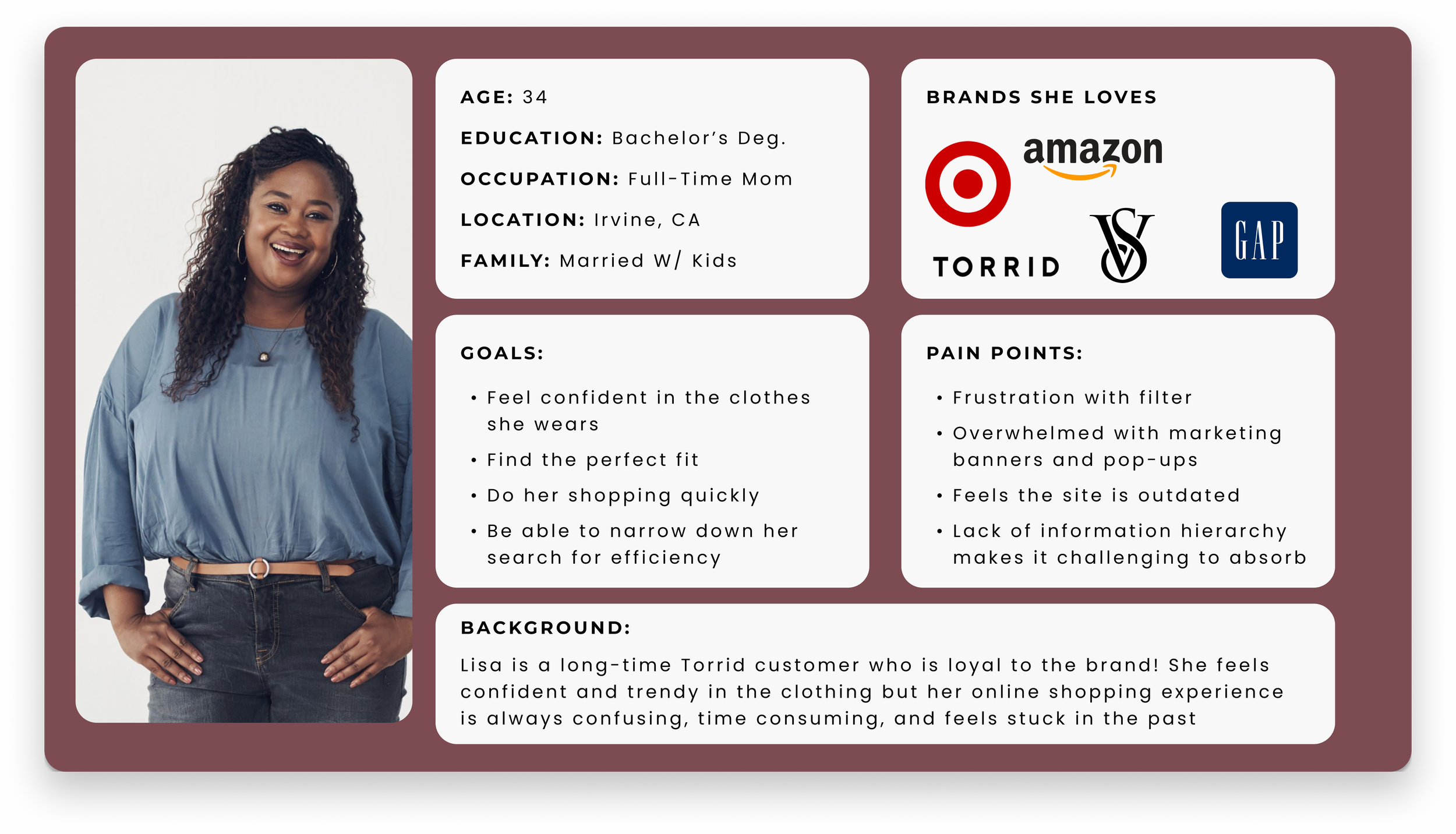
Through observations and findings, I crafted a user persona. She became the north star of the decision and design process.
Ideation Before Creation
Now knowing user pain points, a feature prioritization matrix helps better understand where to focus the scope
Competitor analysis of both desktop and mobile flows gave clarity on industry best practices, talking through aspects that are favorable and unfavorable while navigating
Pen to Paper - sketching down design solutions before getting into low fidelity wireframing is my favorite method!
Small tweaks can make the biggest difference… and there were many!
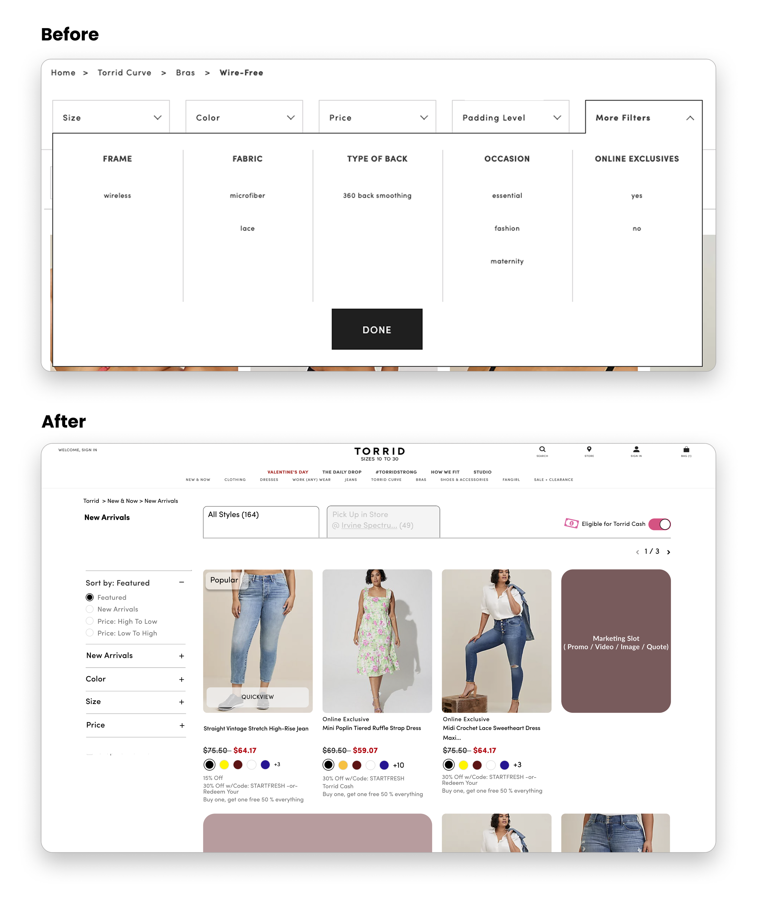
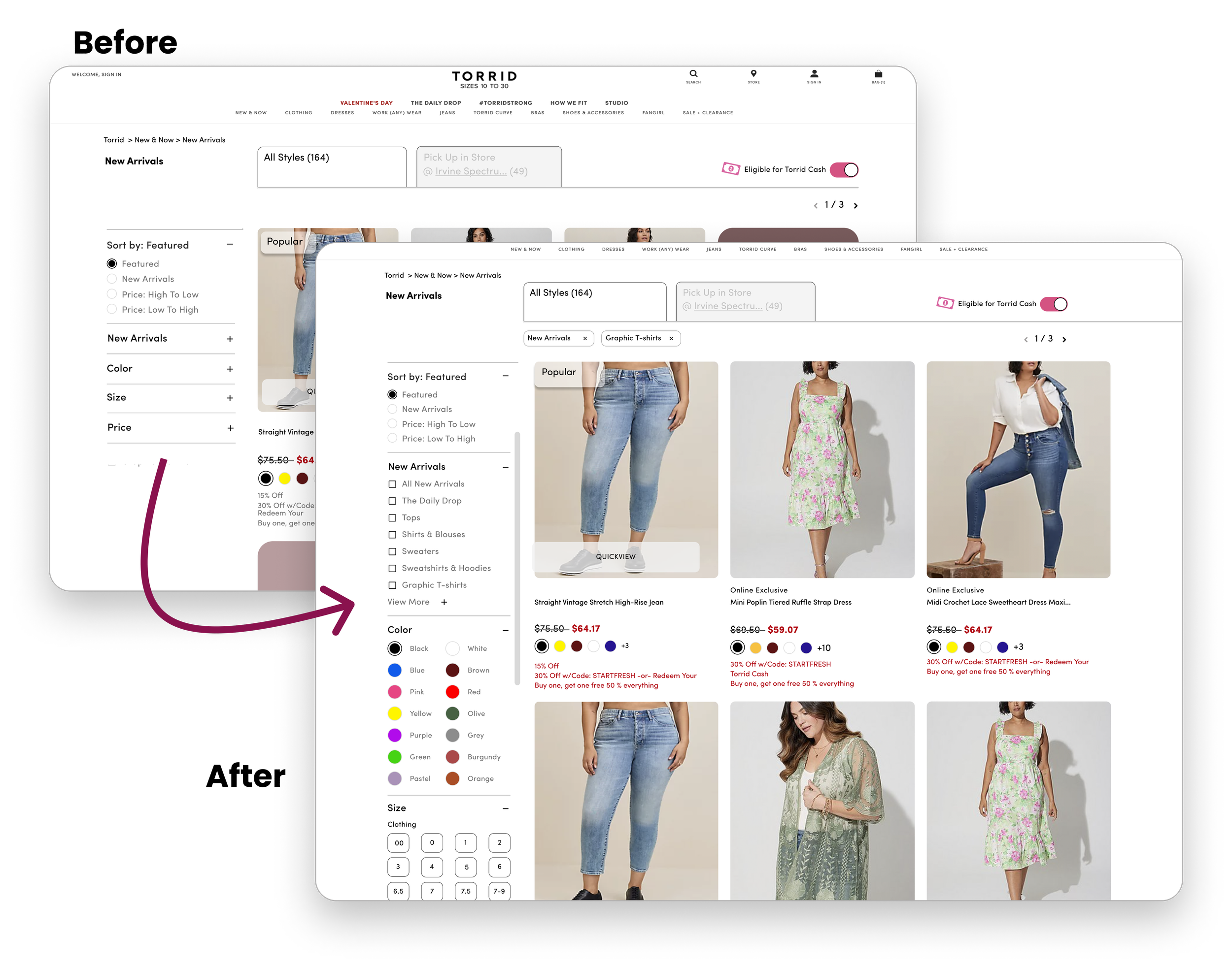
Before and After of ‘Filter’ Experience
Updated individual drop down filters to an “always-exposed” filter on the left side of the PLP
This increased visibility of the products itself by reducing any covered content with filters are interacted with
User could now access all available filters upon scroll, and be able to find her desired products easily
No more “More Filters” needed with new UI:
Through research, we found that ‘Online Exclusive’ and ‘Fabric’ were commonly used, but hidden under a dropdown
With the new structure, there were no hidden filters, allowing all tools to be accessible by the user
Removed marketing banner to keep relevant information ‘above the fold’.
User sees the information they are seeking without having to scroll or hunt for it
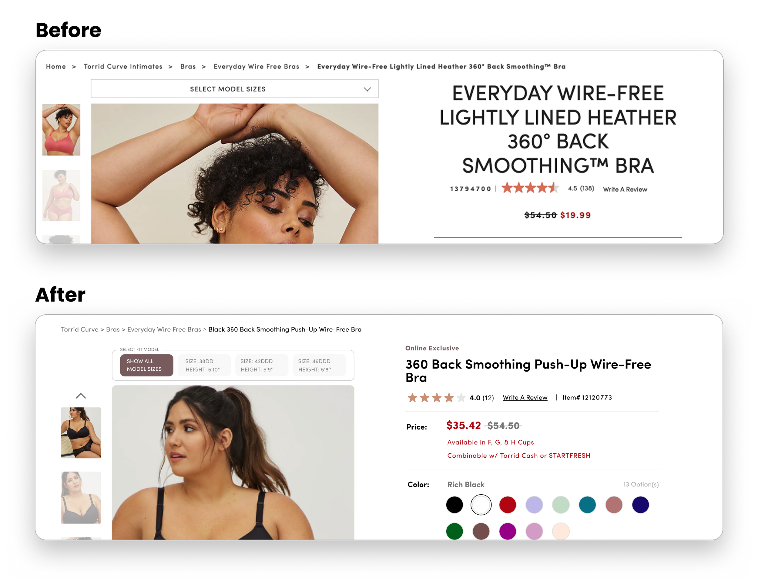
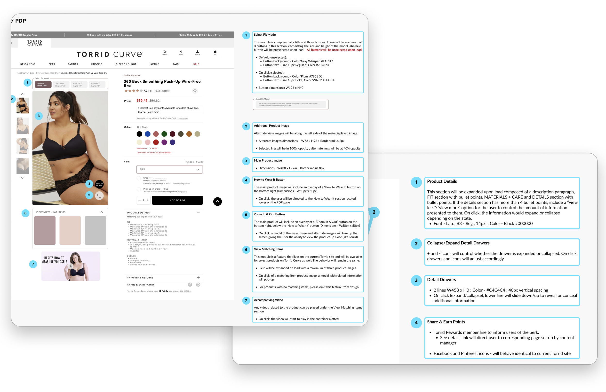
Before and After of Select Fit Model PDP
This design change resurfaced the select fit model experience and increased user engagement with the feature... providing a more digestible, usable, and intuitive interaction.
With product fit and confidence being the users biggest goal, positive feedback from this design change felt like a big win!
What is ‘Select Fit Model’?
A unique feature catered to women of all shapes and sizes
Users are able to select the model to see the product on different body shapes and sizes, allowing them to configure their experience based on what relates most to them
Testing and validating our designs with users.
We ran internal usability tests early on to understand where some of the problem areas were.
After designing each new concept we tested them side by side with the existing design to validate that our design was functional and intuitive.
Below is the summary of functionality updates for the new PLP:
Filters visible on the left side with sticky functionality as customer scrolls down the PLP.
Exposed ‘Sort by’ and ‘Category’ filters.
Single apply categories design with radio button and multiple apply categories designed with checkboxes.
3 product grid vs 4 product grid
Learning from A/B Test Results
The A/B test results showed the desktop 3-product grid PLP version yield a higher AOV (+1.3%), RPV (+1.12%), UPT (+.7%), as well as overall +12% filter engagement vs. control, and 4 product-grid PLP.
Our Solution
Based on research findings we…
opted for the 3-product grid for a more immersive scrolling experience
expanded filters by default to increase usability and access to a commonly used feature
Documentation and Continuous Agile Delivery
Documentation includes notes, annotation, and walkthroughs that will help give context to the designs, understand the thought process, expected actions.
Working with the developers and making necessary pivots based on timelines and feasibility
Accomplishments
What was the final outcome, and impact of this project?
Putting the user in control of their filtering and shopping experience
UX improvements for all platforms resulted in a 18% engagement increase and reduction in bounce rate
Creating an immersive layout with a 3-grid layout on PLP
Improving information hierarchy and alignment on PDP
Updated existing features such as Select Fit Model and Product Filtering to be more accessible for the user
What I learned as a designer:
The user is our north star, always.
The importance of documentation. For future projects, I hope to keep an organized iteration library to better refer back to previous versions of designs
Building a component library while designing, especially for projects with no design system in place
Collaborate with developers earlier in the process
While you’re here…
-

RWD & IA Case Study
-

Mobile App Design